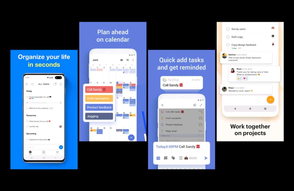
MyTasks is a simple task managing app for college students to complete their important tasks.
As a part of Udacity’s Nanodegree program, I completed end to end design process that includes interaction and visual design work.
I expect the result to help students look at their daily tasks, their priorities, schedule them also remind them.
Chosen KPI – Increase in retention rate will be the KPI which shows the consistency of users. Because if the app didn’t help to achieve them what they want then users won’t engage or return to the app.
For the business, Using the app by users and setting tasks is a success. But for the users, merely scheduling tasks is not enough. They need to get them done. I use Google Calendar, Evernote and Habititca for efficiency in task managing. I believe I can replace those with MyTasks after the development.

Why?
Interruptions and distractions have eroded our abilities to concentrate as there is the fragmentation of our time and focus, such low productivity results in constant stress and loss of time.
Productivity apps can only show impacts when used frequently and consistently. The main challenge was to make the experience seamless such that it can assimilate into the user’s lifestyle. To handle that, I cut down extra features and steps that I intended to add at first.
I focused on one user group: College students (As I had easy access to them to recruit as participants and to focus my effort on the best solution.)

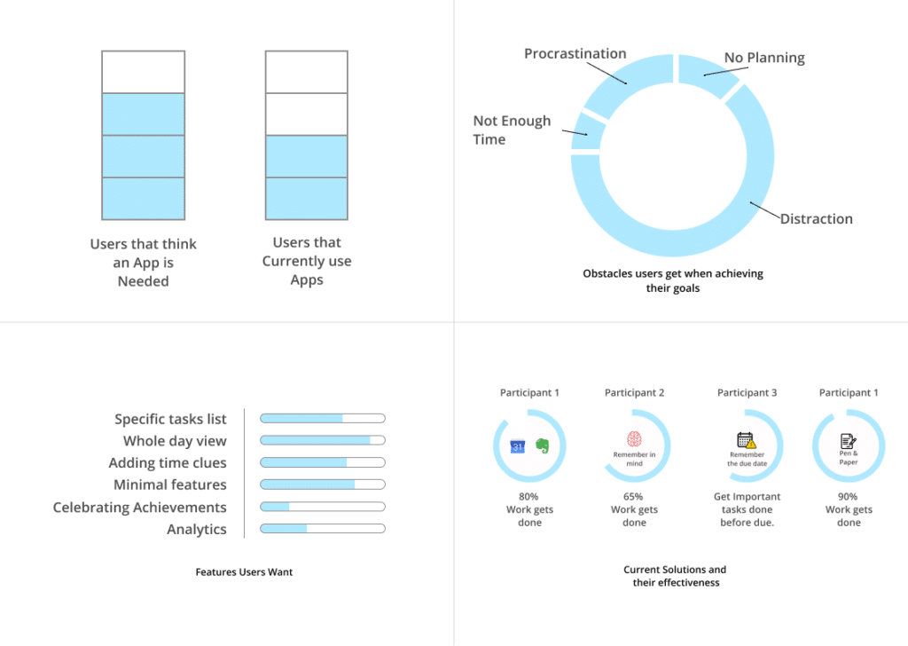
Do users really need a digital app?


Elements Organization & Iteration

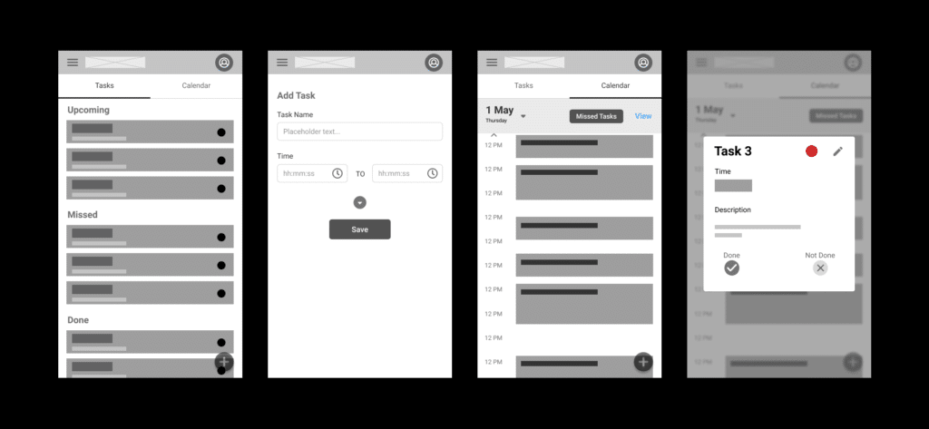
After the usability study, I did iteration and landed on a card-based task list, which allowed easy edit, changing priorities, marking tasks as done or not done by tapping on the card.
I moved the missed task-bar to the bottom with a missed task button at the center as well as quick access to view and navigate weekdays. Removed the drop down button on the Add/Edit task page and moved the Save button to top.

How did the solution work
I conducted remote usability with ten users on Lookback. My goal was to gather insights about how this solution meets their expectations and goals for setting tasks and achieving them.

Final Iterations
- Checked the colour contrast on the accessibility site and did slight change to make it clear.
- Added the time needed option to set a timer or a deadline. The time allocated may not be the accurate but it will force user to think how much time is really needed. Otherwise a single task will take whole day.
- Learning from the usability feedback, moved the reminder button above the viewport height.

It might not be the best design for this product, as it was my first project. Surely it was my best learning experience. I learnt that design is a compromise with our biased decisions and our seemingly best ideas.
The instructors were easy to understand and helpful. They directed us throughout the project and explained that process and thinking are important than the final outcomes for the novices to grow.